A line graph is drawn by plotting data points and joining them with straight lines. It is really only the actual data points that count, but by drawing the lines you get a better impression of the trend in the data points. This method of representation is particularly useful when illustrating trends over time.
Worked Examples
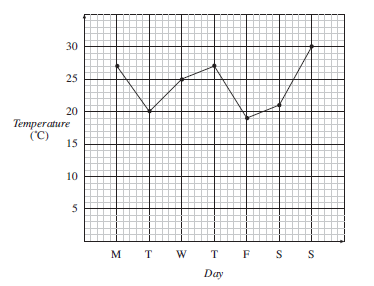
Samuel recorded the temperature in his shed at 6 am each day for a week. His records are shown on this line graph.
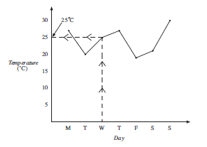
What was the temperature on Wednesday?

For Wednesday the temperature can be read as 25°C.
What was the lowest temperature recorded?
The lowest temperature occurred on Friday and was 19°C.
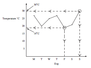
What was the highest temperature recorded?
The highest temperature occurred on Sunday and was 30°C.
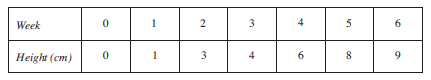
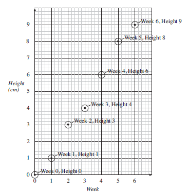
As part of a science project Evan records the height of a plant every week. His results are shown in this table.
Draw a line graph to show the data.
First draw a suitable set of axes.
Then plot a point for each measurement as shown on the following graph.
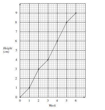
The points can then be joined with straight lines as shown in the next graph.
Exercises
