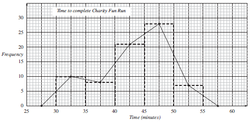
For continuous data, when any value over a range of values is possible, a frequency graph like the one below should be used, rather than a bar chart which is used for discrete data.

A graph like this is often called a histogram, and is characterised by having a continuous scale along the horizontal axis. Note that in this case the widths of the bars are all the same, but this is not always the case, as you will see in the next section. Care though must be taken about the end points. For example, the first class interval (in minutes) would normally be 30 ≤ time < 35, so that a time of 35 minutes would be in the second class interval.
A frequency polygon could also be used to show the same data, as on the following graph. Note how it is related to the histogram.
Worked Examples
Use the data shown on the graphs above to answer these questions.
How many people completed the Fun Run in between 40 and 45 minutes?

The 40-45 minute interval contains 21 people.
How many people completed the Fun Run in less than 40 minutes?
The 30-35 and 35-40 minute intervals must be considered.
There are 10 people in the 30-35 minute interval.
There are 8 people in the 35-40 minute interval.
So there are 10 + 8 = 18 people who complete the run in less than 40 minutes.
How many people completed the Fun Run in less than 1 hour?
The number in each interval is needed.
So the number of people is:
10 + 8 + 21 + 28 + 7 = 74
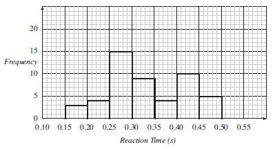
A group of students measured the reaction times of 50 other students. The times are given below correct to nearest hundredth of a second.
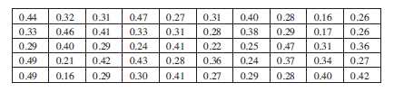
Draw a histogram for this data.
First the data must be collected into groups, using a tally chart.

Now that the data has been collected in this way, the histogram below can be drawn.
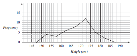
Draw a frequency polygon for the data on the height of children, given in cm, in the table below.
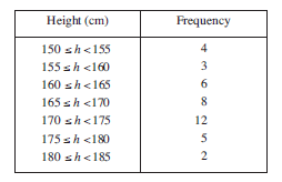
Points should be placed above the centre of each interval. The height is given by the frequency. The following graph shows these points.

Note that points have been placed on the horizontal axis in the intervals that have frequencies of 0. The points can then be joined to give the frequency polygon below.
Exercises
