When drawing histograms it is possible that the intervals will not have the same width.
Consider the data given in the table below.

The way the data have been presented makes it impossible to draw a histogram with equal class intervals.
In order to keep the histogram fair, the area of the bars, rather than the height, must be proportional to the frequency. So on the vertical scale we plot frequency density instead of frequency, where
Frequency Density =
Rewriting the table with an extra column for frequency density, gives

and you can draw the histogram with frequency density on the vertical axis.

Note
You can see that it is the area that is proportional to the frequency – in fact, a frequency of 1 is represented by 10 little squares.
Worked Examples
Traffic police recorded the speeds of vehicles passing a speed camera on an open road. Draw a histogram for this data.
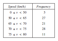

The following table shows how the frequency density can be calculated.

The histogram is shown below.

The histogram below shows the results of a survey into the height of students in a school,

find the number of students with heights between:
120 and 140 cm,
For the 120 to 140 cm interval:
| Frequency Density | = 1.2 |
| Class Width | = 20 |
| Frequency | = 20 × 1.2 |
| = 24 students |
170 and 175 cm.
For the 170 to 175 cm interval:
| Frequency Density | = 2.4 |
| Class Width | = 5 |
| Frequency | = 5 × 2.4 |
| = 12 students |
find the total number of students measured.
To find the total, the numbers in each class interval must be found and added together.
| Total | = 20 × 1.2 + 10 × 1.8 + 15 × 2.2 + 5 × 2.8 + 5 × 2.4 + 5 × 1.8 + 10 × 1.1 |
| = 24 + 18 + 33 + 14 + 12 + 9 + 11 | |
| = 121 |
Exercises
