Cumulative frequencies are useful if more detailed information is required about a set of data. In particular, they can be used to find the median and inter-quartile range.
The inter-quartile range contains the middle 50% of the sample and describes how spread out the data are. This is illustrated in Worked Example 2.
Worked Examples

For the data given in the table, draw up a cumulative frequency table and then draw a cumulative frequency graph.

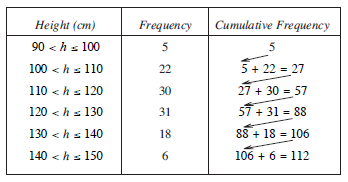
The table opposite shows how to calculate the cumulative frequencies.

A graph can then be plotted using points as shown opposite.
Note
A more accurate graph is found by drawing a smooth curve through the points, rather than using straight line segments.

The cumulative frequency graph below gives the results of 120 students on a test.

Use the graph to find:
the median score,
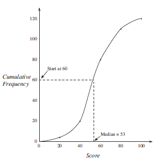
Since of 120 is 60, the median can be found by starting at 60 on the vertical scale, moving horizontally to the graph line and then moving vertically down to meet the horizontal scale.
In this case the median is 53.
the inter-quartile range,

To find out the inter-quartile range, we must consider the middle 50% of the students.
To find the lower quartile, start at of 120, which is 30.
This gives
Lower quartile = 45
To find the upper quartile, start at of 120, which is 90.
This gives
Upper Quartile = 67
The inter-quartile range is then
| Inter - quartile Range | = Upper Quartile − Lower Quartile |
| = 67 − 45 | |
| = 22 |
the mark which was attained by the top 10% of the students,

Here the mark which was attained by the top 10% is required.
10% of 120 = 12
so start at 108 on the cumulative frequency scale.
This gives a mark of 78.
the number of students who scored more than 75 on the test.

To find the number of students who scored more than 75, start at 75 on the horizontal axis.
This gives a cumulative frequency of 105.
So the number of students with a score greater than 75 is
120 − 105 = 15
As in Worked Example 1, a more accurate estimate for the median and inter-quartile range is obtained if you draw a smooth curve through the data points.
The table below shows the distribution of marks on a test for a group of 70 students.

Copy and complete the table to show the cumulative frequency for the distribution.
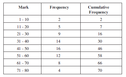
Using a scale of 1 cm to represent 5 marks on the horizontal axis and 1 cm to represent 5 students on the vertical axis, draw the cumulative frequency curve for the scores.

What assumption have you made in drawing your curve through the point (0, 0)?
Assumption that no student scored zero.
The pass mark for the test is 47. Use your graph to determine the number of students who passed the test.
70 − 42 = 28 students passed the test.
What is the probability that a student chose at random had a mark less than or equal to 30 ?
Probability = = .
The heights, in metres, of a random sample of 40 soldiers from a regiment were measured. The heights are summarised in the following table.

Copy and complete the cumulative frequency column in the table.
The completed cumulative frequency table is given below.
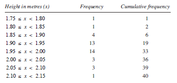
Construct a cumulative frequency curve for the data.

Estimate from this cumulative frequency curve:
1.955
1.99
1.915
Compare your values of (Q3 − Q2) and (Q2 − Q1).
Q3 − Q2 = 0.035 , Q2 − Q1 = 0.04
What does this indicate about the shape of the distribution?
Q2 − Q1 > Q3 − Q2 , hence (positive) skew to the data; that is, it is not symmetric.
Exercises

Information
A quartile is one of 3 values (lower quartile, median and upper quartile) which divides data into 4 equal groups.
A percentile is one of 99 values which divides data into 100 equal groups.
The lower quartile corresponds to the 25th percentile. The median corresponds to the 50th percentile. The upper quartile corresponds to the 75th percentile.