

The box and whisker plot is another measure of variation that enables you to illustrate and compare the measures of both location and variation through the median and quartiles.
For example, for the data set below, we can easily find the median and quartiles.
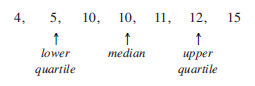
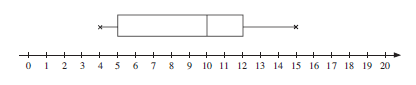
The box is formed by the two quartiles, with the median marked by a line, whilst the whiskers are fixed by the two extreme values, 4 and 15.
The plot is shown below, relative to a scale.
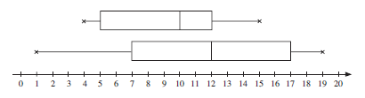
Box and whisker plots are particularly useful when comparing quickly two sets of data.
For example, if you wish to compare the data set above with the following data set,
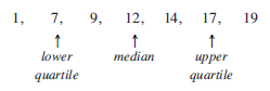
then you can illustrate the two plots together. This is shown below – you can immediately see that the data in the second set are much more spread out than that in the first set.
Outliers
Outliers are extreme values in data sets and are often ignored as they can distort the data analysis. We make the concept precise by defining an outlier as 'any value which is either 1.5 times the interquartile range (IQR) more than the upper quartile (UQ) or 1.5 times the IQR less than the lower quartile (LQ). This is illustrated below.
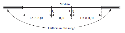
Any outlier should be marked on the box and whisker diagram but the whisker should extend only to the lowest and highest values which are not outliers.
Worked Examples
The number of goals scored by the 11 members of a football team in 2007 were as follows:
6 0 8 12 2 1 2 9 1 0 11
We first put the number of goals in increasing order, i.e:
0 0 1 1 2 2 6 8 9 11 12
Find the median.

There are 11 data points, so the median is the ⎛
⎝⎞
⎠th value, i.e. the 6th value, which is 2.
Find the upper and lower quartiles.
The lower quartile is the ⎛
⎝⎞
⎠th value, i.e. the 3rd value, which is 1; the
upper quartile is the 9th value, i.e. 9.
Find the interquartile range.
Interquartile range = 9 − 1 = 8.
Explain why, for this set of data, the interquartile range is a more appropriate measure of spread than the range.
The interquartile range is a better measure to represent the 'average' spread, rather than the range, as it excludes the outlying values.
The goals scored by the 11 members of the hockey team in 2008 are summarised in the box and whisker plot below.
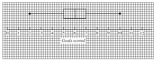
On a copy of the diagram, summarise the results for 2007 in the same way.
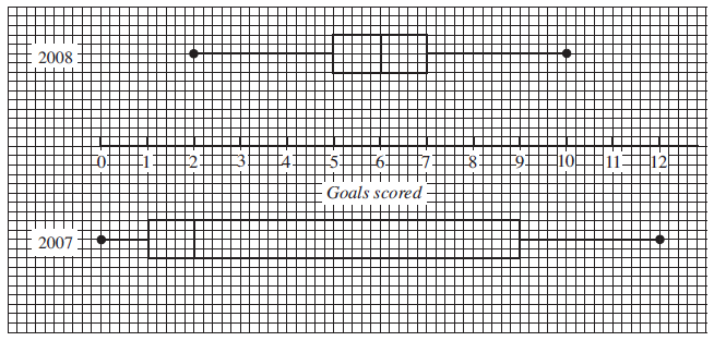
Do you think the team scored more goals in 2008? Explain your reasoning.
The team scored more goals in 2008; the median in 2007 is much lower.
The cumulative frequency curve represents the times taken to run 1500 metres by each of the 240 members of the athletics club, Weston Harriers.
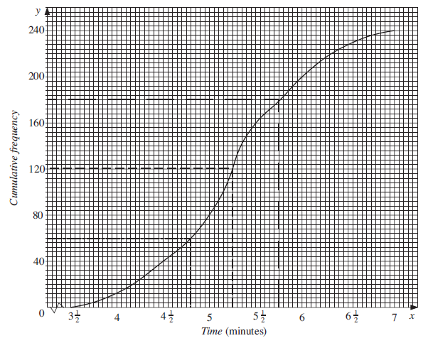
From the graph, find:
the median time;
From the dashed line (120 on the vertical axis), the median is minutes or 5 minutes 15 seconds.
the upper quartile and the lower quartile.
Similarly:
the upper quartile is minutes or 5 minutes 45 seconds,
the lower quartile is 4 min 48 sec (width of each small square is 3 seconds)
Draw a box and whisker plot to illustrate the data.
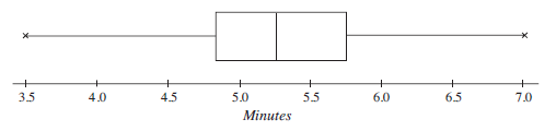
Use your box and whisker plot to make one comment about the shape of a histogram for these data.
The data are almost symmetric about the median.
A rival athletics club, Eastham Runners, also has 240 members. The time taken by each member to run 1500 metres is recorded and these data are shown in the following box and whisker plot.
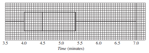
Use this diagram to make one comment about the data for Eastham Runners compared with the data for Weston Harriers.
The data for Eastham Runners are skewed to the left, with a lower median time. Hence Eastham Runners' data are significantly better than Western Harriers' data, indicating relatively more athletes with faster times.
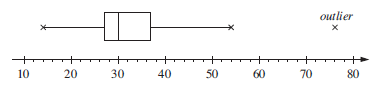
The ages (in years) of a group of people visiting a club are given below.

Identify any outlier.
First identify the median and upper and lower quartiles of the 27 data values.
Putting the data in increasing order gives:

The median is the ⎛
⎝⎞
⎠th value,
i.e. the 14th value ⇒ 30
The lower quartile is the ⎛
⎝⎞
⎠th value,
i.e. the 7th value ⇒ LQ = 27
The upper quartile is the ⎛
⎝⎞
⎠th value,
i.e. the 21st value ⇒ UQ = 37
The interquartile range is 37 – 27 = 10.
Now check for outliers, remembering that the outliers must be less than
LQ – 1.5 × IQR = 27 – 1.5 × 10 = 27 – 15 = 12
or more than
UQ + 1.5 × IQR = 37 + 1.5 × 10 = 37 + 15 = 52
The only outlier is 76.
Illustrate the data using a box and whisker plot.
This box and whisker plot illustrates the data.
Exercises
